We are very proud of the quality service we provide at Inglewood Community Childcare Centre. We have worked hard to deliver a purpose built Childcare facility, employ qualified teachers and have the highest ERO report available. The logo has been the embodiment of this journey and it means a lot to us. So to change or alter the logo was something that we did not take lightly, in fact something we resisted in fact. However, times move forward and so do design principles. The designers at SpecialEyes made us feel comfortable about “updating” our logo and brand, working with us to understand its importance to us. It is way more than just an image, its a symbol of our values, our principles and has been with us since the beginning.
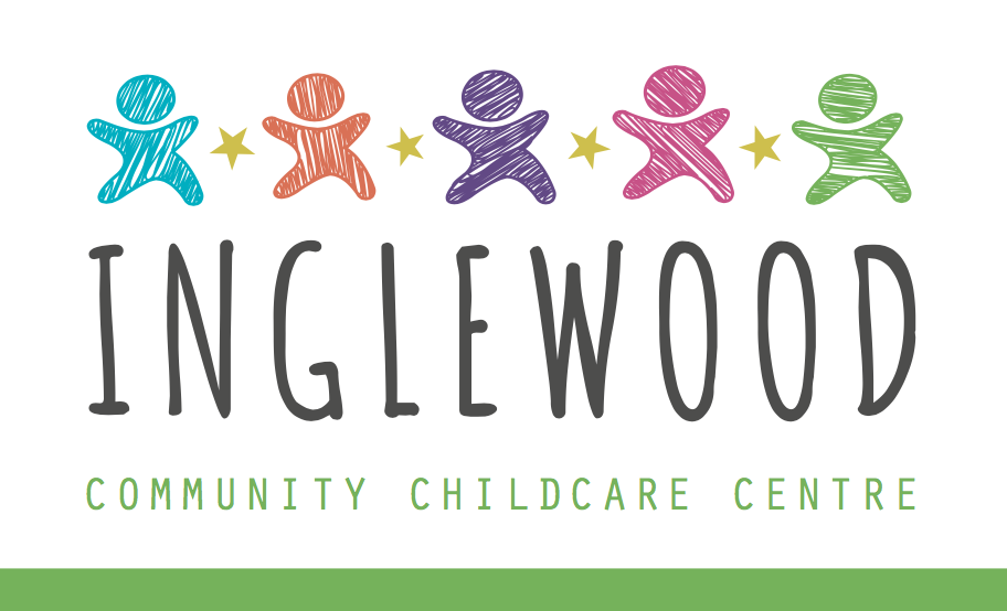
Utilising modern design principles, the new logo and branding builds on our history and values, connects with adults and children alike, and its certainly going to stand out … when you see our new logo, there will be no question that it is us!! The two variations of the logo have been designed to be used in various landscape and portrait formats. The nads have been designed to represent the teachers, the children and whanau working together to provide exceptional learning and play experiences, to learn from each other, to smile, to enjoy … and all in a safe and nurturing environment.
We would love to hear your thoughts about the new design for our logo. If you have any feedback, please let us know. Thnaks